
Affiliate Disclaimer: This post may contain affiliate links. As an affiliate, I may earn a commission if you purchase through my links, at no extra cost to you. Please read our full disclosure for more info.
Now that you’ve finished setting up your Pinterest business account for success, your foundation is solid.
Your profile is optimized, your boards are categorized, and you are ready to start driving traffic to your blog.
But there is a catch: none of that technical setup matters if users scroll right past your content.
On Pinterest, your pin graphic is the gatekeeper to your blog. If it doesn’t capture attention, spark curiosity, and clearly communicate value within a fraction of a second, you won’t get the click.
In this guide, we are going to break down exactly how to design Pinterest pins that actually convert, focusing on data-backed strategies over aesthetic vanity.
What you will learn
By the end of this guide, you’ll know how to:
- Design pins that actually get clicks
Use high-contrast colors, clear messaging, and simple layouts that stand out in a fast-moving Pinterest feed. - Choose fonts that stay readable on mobile
Apply the 2-second rule and pick typography that looks clean and sharp on a 6-inch screen. - Add strategic calls-to-action to boost CTR
Write simple, direct CTAs that tell users exactly what they’ll get when they click. - Build a complete pin in Canva, step by step
Go from blank canvas to finished pin using free Canva tools—dimensions, backgrounds, overlays, text, and export settings. - Use AI (Gemini) to brainstorm clickable pin titles
Plug in a proven prompt to generate short, punchy text overlays that fit your design and niche. - Design pins that earn saves, not just clicks
Understand the “save psychology” and how to make your pins look like useful resources people want to bookmark.
Why Pin Design Matters More Than Ever in 2026 & Beyond
Pinterest is a visual search engine. Unlike Google, where users read meta descriptions, Pinterest users “read” images.
In recent years, the platform has become increasingly saturated with high‑quality content.
Users scroll quickly on their mobile devices, and their eyes are trained to ignore generic, cluttered, or difficult‑to‑read images.
To stand out today, you need a strategic approach to design.
A beautiful pin that lacks clear messaging will fail, while a simple, highly readable pin that promises a solution to the user’s problem will thrive.
Your goal is not to win an art contest — your goal is to win the click.
The 3 Core Elements of a Click-Worthy Pin
Every successful pin design relies on three non‑negotiable elements. If even one is missing, your click‑through rate (CTR) will suffer.
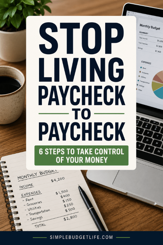
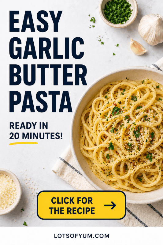
Your pin needs to pop against Pinterest’s white background. Using pale, low‑contrast colors (like light pink text on a white background) is a guaranteed way to get lost in the feed.
Instead, use high‑contrast color combinations. Dark text on a light background, or bright text on a dark background, ensures your message is immediately legible.
Also choose authentic, relatable background images. Heavily staged, corporate stock photos are often ignored. Opt for realistic imagery that gives context to your blog post topic.
2. Readable Typography on Mobile (The 2‑Second Rule)
The vast majority of Pinterest users scroll the platform on their mobile phones.
That beautiful, sweeping script font you love might look great on your desktop monitor, but it will look like an illegible blur on a 6‑inch smartphone screen.
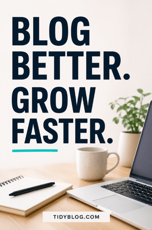
The 2‑Second Rule: A user should be able to read your entire pin title in two seconds or less while scrolling.
Stick to bold, clean sans‑serif or serif fonts for your main keywords. If you want to use a script font for aesthetic flair, use it sparingly as an accent word — never for the core message of the pin.
3. Compelling Call-to-Action (CTA) Prompts
Don’t assume the user knows what to do next. You have to tell them.
Including a small, clear Call-to-Action (CTA) directly on the pin graphic can significantly boost your click-through rate. Simple phrases tell the user exactly what they get by clicking through to your blog.
Examples include:
- “Read the full guide!”
- “Get the free printable!”
- “Click here for the recipe!”
Step-by-Step: Designing Your First Pin in Canva
You don’t need expensive software like Adobe Photoshop to create high‑converting pins. Start with the free version of Canva — it’s beginner‑friendly and includes everything required to design your first batch of pins.
Once your strategy is validated and you begin seeing traffic, Canva Pro becomes an optional upgrade for premium stock photos and the background remover tool. For now, the free version is more than enough.
Now let’s walk through the exact steps to build your first Pinterest pin from scratch.
Step 2: Setting the Optimal Dimensions (1000 x 1500px)
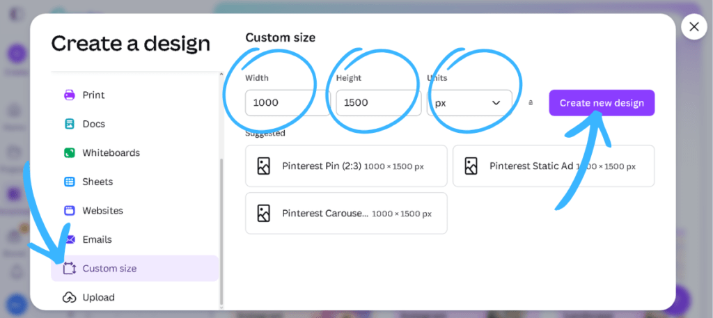
Pinterest strongly prefers vertical pins with a 2:3 aspect ratio. Anything shorter gets lost in the feed, and anything longer may be cut off.
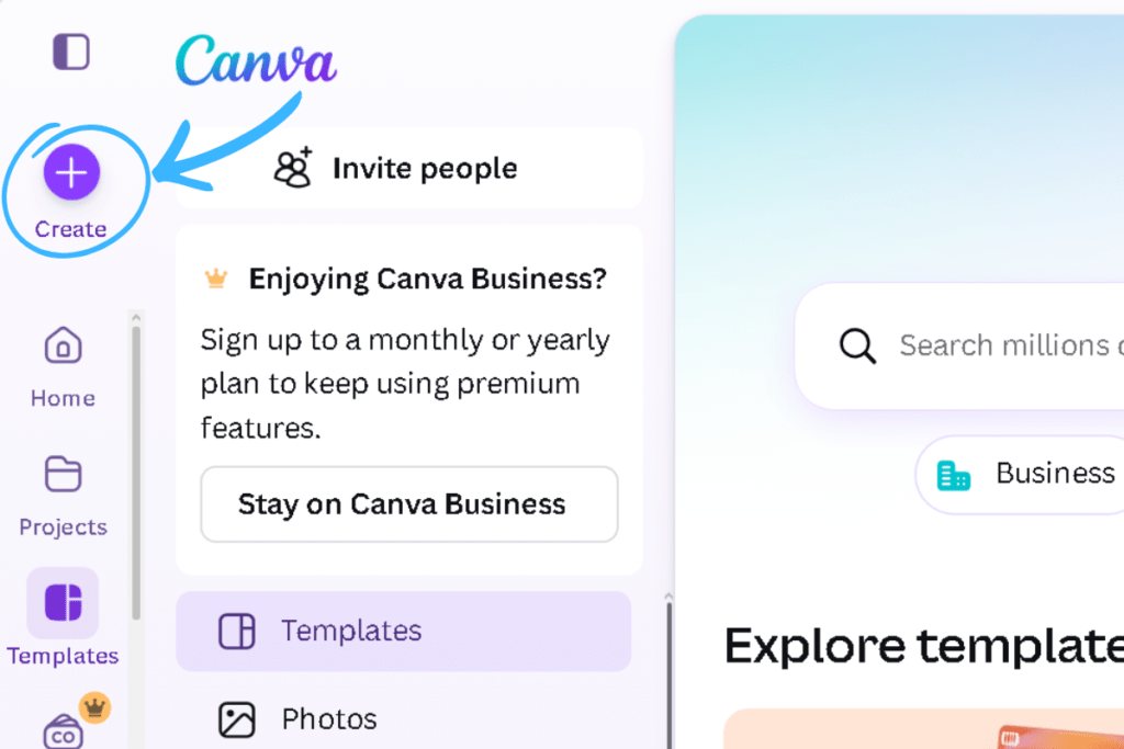
Click Create in the top‑left corner. A window will appear. On the left panel, scroll down and click Custom size. Enter 1000 for the width and 1500 for the height, then click Create new design.
Step 3: Layering Your Authentic Background
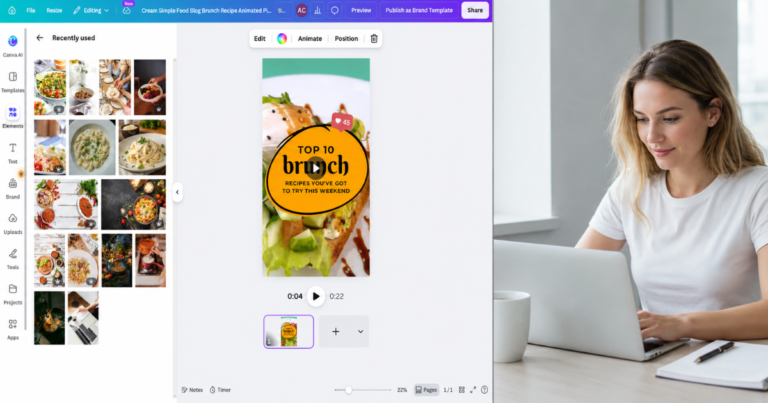
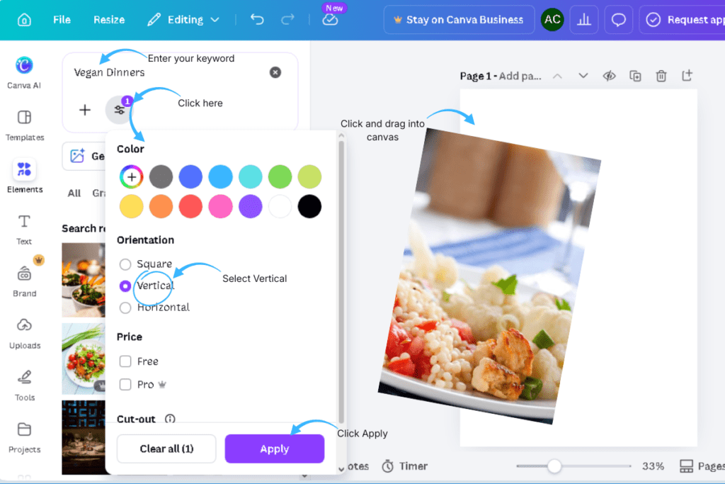
On your blank canvas, go to the left sidebar and click “Elements” to search for free photos, or click “Uploads” to bring in your own authentic image. Drag your chosen image so it snaps into place and covers the entire 1000×1500 canvas.
Step 4: Adding a Text Overlay Box
If your background image is busy (lots of colors or textures), you need to create a text overlay box to keep your text readable.
On the left panel, click Tools, then select Shape. A new panel will open.
Choose a square shape and click it to add it to your canvas. Stretch the shape over a portion of your image, then change the color to white or a dark color.
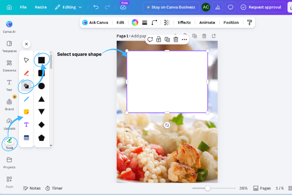
Step 5: Adjusting Overlay Transparency
To make the design look cohesive, lower the transparency of the overlay box so the background image peeks through.
With the shape selected, click the Transparency icon in the top toolbar and reduce the opacity to around 85%, keeping it solid enough for your text to stay readable.
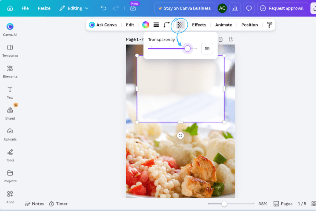
Step 6: Adding Your Bold Typography
To add text to your pin, click Text in the left panel and choose “Add a heading.” Make your main keyword the largest text on the screen.
For example, if your post is “15‑Minute Vegan Dinners for Busy Moms,” make the words “15‑Minute Vegan Dinners” massive, bold, and easy to read.
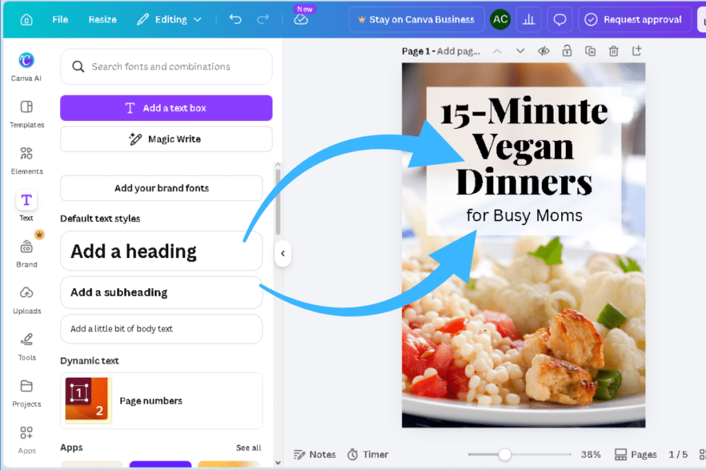
Step 7: Adding Your Branding and Exporting
Finally, always brand your pins. Add your website URL (e.g., yourblog.com) to the very bottom or top of the pin.
This builds brand recognition and protects your original graphics.
When you’re ready to export, click the Share button in the top‑-right corner, choose Download, and save your pin as a high‑-quality PNG file.
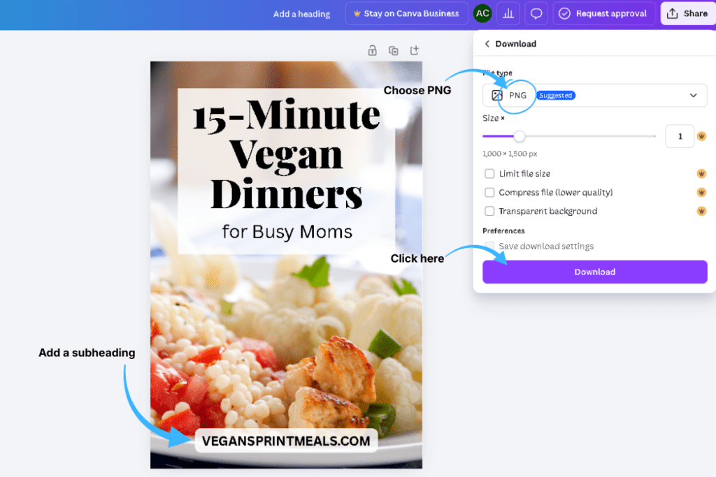
🤖 AI Assistance: Using Gemini to Brainstorm Clickable Pin Titles
Sometimes the hardest part of design isn’t the graphics; it’s figuring out what text to put on the pin. You can use Google Gemini (a free AI tool) to brainstorm catchy, click-worthy pin titles.
Copy and paste this exact prompt into Gemini:
“I am designing a Pinterest pin for my blog post about [INSERT TOPIC]. My target audience is [INSERT AUDIENCE]. Please give me 10 short, punchy, high-contrast text overlay ideas to put on the pin graphic. The text must be under 8 words, create curiosity, and encourage users to click through to read more.”
Select the best result and use it as the main text for your Canva design!
The Save Psychology: Getting Users to Bookmark Your Content
On Pinterest, a “Save” (formerly a repin) is incredibly powerful. It tells the Pinterest algorithm that your content is valuable, which pushes it out to more users.
To design for Saves, think about why people bookmark things. They save things they want to reference later: checklists, step-by-step summaries, infographics, and “how-to” cheat sheets.
If you can incorporate a sense of utility into your pin design—making it look like a helpful resource rather than just an advertisement—users are far more likely to save it to their boards for future reference.
Ready for the Next Step?
Designing pins that convert takes a little practice, but by sticking to a 2:3 ratio, prioritizing high-contrast readability, and giving users a clear CTA, you will see your click-through rates climb.
If you are serious about mastering this platform, I highly recommend checking out Anastasia Blogger’s Pinterest SEO course. It provides an incredibly deep dive into exactly what the algorithm favors right now.
Now that your designs are optimized, the next step is making sure you’re creating content people actually search for on Pinterest.
In the next guide, we’ll walk through how to use Pinterest Trends to find popular topics for your new blog — so you can design pins that get discovered faster and attract the right audience.